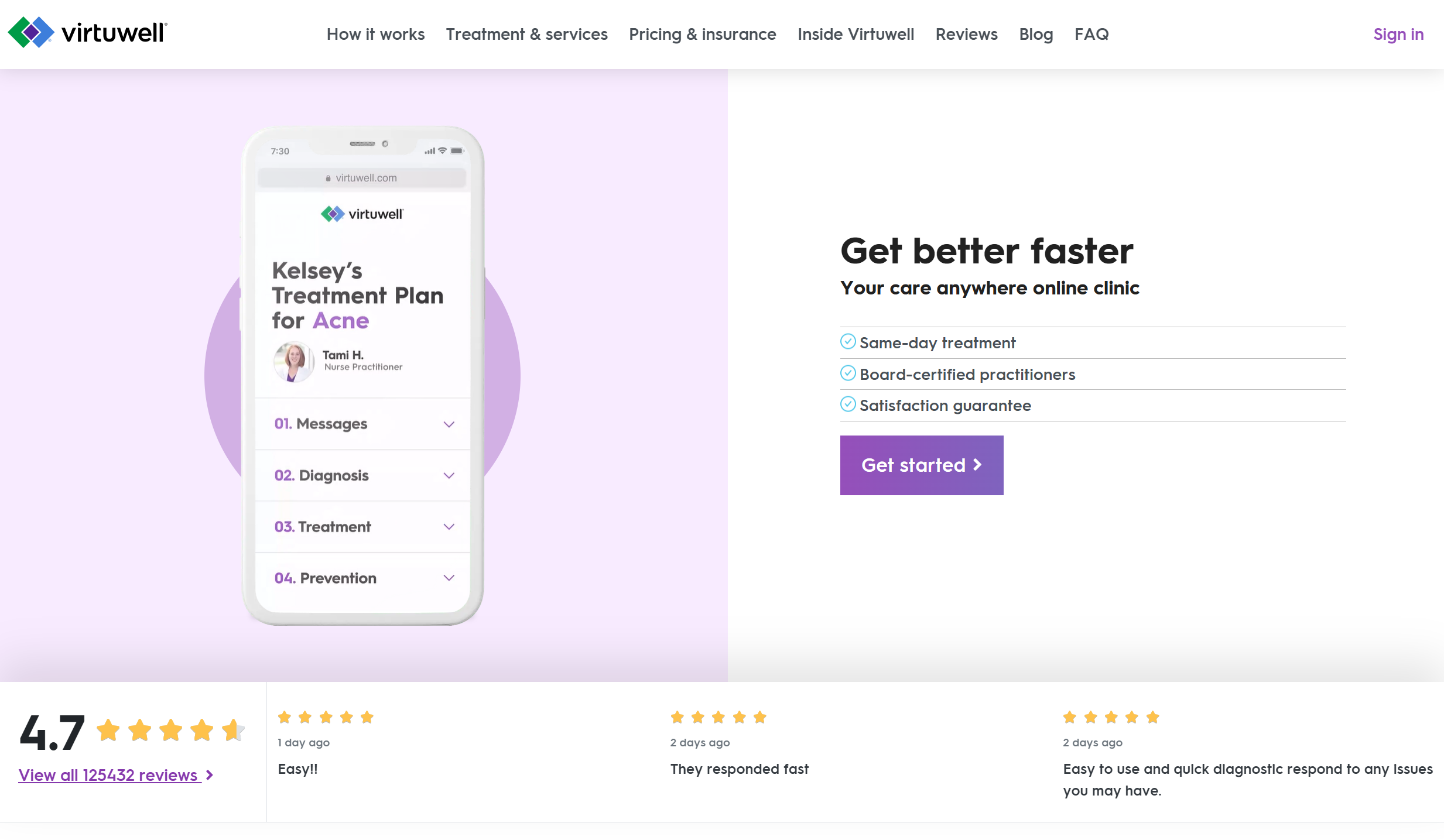
Modernizing a patient-facing healthcare web application by redesigning the experience and upgrading the frontend architecture to improve trust, accessibility, and completion rates.
A 24/7 online clinic for patients seeking virtual care—rebuilt from the ground up with accessibility-first design and native form controls.
Visit virtuwell
An outdated experience was eroding patient trust—and in healthcare, trust directly impacts outcomes.
virtuwell's patient interview was the heart of the service—where patients describe their symptoms and health history to receive a diagnosis. But the existing experience, built on Angular 1.6, had accumulated years of accessibility and usability debt. It felt cluttered, noisy, and difficult to focus on.
For patients already anxious about their health, this friction was more than an inconvenience. Many users simply didn't trust the platform enough to complete their interview—abandoning at critical moments when they should have been getting care.
The interview process felt overwhelming. Patients struggled to focus on accurately sharing their symptoms. Over-designed interactions and inconsistent layouts created cognitive overload at the worst possible moment.
Custom form controls caused high maintenance and accessibility churn. Keyboard and assistive-technology users were blocked entirely—a critical failure for a healthcare platform that should serve everyone.
Inconsistent layouts and spacing hurt scalability. Supporting multiple devices and browsers was increasingly fragile. Every fix risked breaking something else—slowing the team's ability to improve.
Frontend Engineer — UX Engineering, Architecture & Implementation
I led the frontend modernization of virtuwell's patient interview experience and marketing pages. My focus was bridging design vision with engineering feasibility, implementing accessibility-first patterns, and building a scalable architecture that would serve patients for longevity.
Bridged design and engineering from the earliest wireframes. Introduced a 12-column grid system to bring consistency and advocated for removing all custom form components in favor of visually styled native inputs—a decision that unlocked built-in accessibility.
Owned responsive implementation across mobile, tablet, and desktop. Ensured reliable behavior across multiple iOS versions and Internet Explorer—critical for reaching patients on older devices. Accounting for retina screens, high-DPI displays, and varying network conditions, I optimized performance and visual fidelity across all devices.
Led the shift from "fix accessibility later" to "design accessibility-first"—a major mindset shift for the team that paid dividends in reduced maintenance and better user experience for all patients.
We combined quantitative and qualitative research to understand the depth of patient frustration and identify clear paths forward. The data painted a consistent picture: patients wanted simplicity, not creativity.
Google Analytics revealed where patients dropped off, which paths led to completion, and how behavior varied across devices. We mapped the entire interview funnel, identifying the exact moments where friction was costing us patients.
We conducted remote usability testing with users worldwide, watching real patients navigate the interview process. The diversity of devices, browsers, and contexts revealed issues we never would have found in a lab.
Local moderated sessions, recorded for deeper insight, gave us the nuanced feedback that numbers can't capture. We watched body language, heard sighs of frustration, and celebrated "aha" moments together.
Speed and clarity over creativity. Patients didn't want clever interactions—they wanted to complete their interview quickly and confidently. Over-designed elements were causing abandoned interviews.
Progress visibility matters. Users wanted to know how far along they were and whether they could return later. The lack of progress indication created anxiety about losing their work.
Trust and security are paramount. When sharing sensitive health data, perceived security was just as important as actual security. The design needed to signal "your information is safe here."
A minimalist, accessibility-first redesign built on native form controls
Design explored minimalist healthcare patterns, aiming for a premium but restrained experience. As the UX engineer, my focus was bridging design vision with engineering feasibility—and making a critical architectural decision that would shape everything.
We removed all custom form components in favor of visually styled native inputs. This single decision unlocked built-in accessibility, native mobile form controls, and dramatically lower maintenance. Instead of fighting the platform, we embraced it.
Introduced a consistent grid system to bring order to chaos. Every element had a logical place, creating visual rhythm that reduced cognitive load.
Replaced custom components with styled native inputs. This gave us built-in accessibility, mobile-optimized keyboards, and browser autocomplete—for free.
Instead of fixing accessibility later, we designed for it from the start. Every component was keyboard-navigable and screen-reader friendly from day one.
Stripped away visual noise. Generous whitespace, clear typography, and subtle color helped patients focus on what mattered: describing their symptoms.
Clear progress indicators showed patients where they were in the interview. Combined with session caching, patients could leave and resume without losing work.
Added reviews/testimonials sections and clear HIPAA-compliant privacy messaging. Visual trust signals reinforced that patient data was protected.
Built for responsiveness, longevity, and maintainability across every device and browser.
I implemented the 7-1 SASS architecture pattern to organize variables, themes, utilities, and components. This created a single source of truth for design tokens—colors, typography, spacing—that the entire team could rely on.
The result: changes to the design system could be made in one place and cascade everywhere, eliminating inconsistency and reducing maintenance burden.
BEM naming conventions kept components predictable and easy to debug. Combined with a custom Bootstrap-based framework built around our 12-column grid, the CSS was self-documenting and intuitive.
These systems ensured the UX could scale without regressions. New features could be added with confidence that they wouldn't break existing functionality.
Responsiveness and longevity were non-negotiable. I owned the implementation across mobile, tablet, and desktop—ensuring reliable behavior across multiple iOS versions and even Internet Explorer.
In healthcare, you can't assume your users have the latest devices. Patients on older phones in rural areas deserve the same quality experience as those on the newest iPhone.
See how the redesigned interview experience guides patients through sharing their symptoms with clarity and confidence.
We tested in two complementary ways: remote scenario-based testing with users worldwide, and in-person moderated sessions recorded for deeper insight. Each round of feedback shaped the next iteration.
Patients from diverse locations navigated realistic scenarios—"You woke up with a sore throat, find out if virtuwell can help." We watched where they stumbled, where they succeeded, and where they gave up.
Local participants provided nuanced feedback that remote testing couldn't capture. Body language, tone of voice, and real-time follow-up questions gave us deeper understanding of patient needs.
Feedback revealed patients wanted to leave and resume interviews. We implemented session caching so progress was never lost—a critical feature for patients who might be interrupted by symptoms.
Continued alignment with HIPAA requirements and privacy expectations. Added reviews/testimonials to build first-time user trust—showing that real patients had positive experiences.
The redesigned experience delivered measurable improvements across every metric that mattered.
The final experience was everything we'd worked toward: a calm, modern, and accessible interview flow with native, reliable interactions across every device. Clear progress indicators and reduced cognitive load meant patients could focus on what mattered—getting care.
More patients completing their health interviews with confidence
Consistently high ratings from patients across all demographics
More first-time patients choosing virtuwell for their care
Full WCAG 2.0 compliance across the entire interview flow
"The new interview feels like talking to a real person. It's calm, clear, and I actually trust it with my health information."— Patient Feedback Survey
This project reinforced principles I'll carry into every future role—lessons about simplicity, architecture, and what it means to build for real people with real needs.
Especially in healthcare. Patients don't want creativity—they want to get care. Every element we removed was a barrier we eliminated. The simplest solution was often the best solution.
The 7-1 SASS architecture and BEM naming weren't just engineering decisions—they enabled design consistency at scale. When the architecture is right, quality becomes sustainable.
Designing for accessibility from the start was easier and more maintainable than trying to retrofit it later. Native form controls gave us accessibility for free—a lesson in working with the platform, not against it.
Being embedded in design from day one meant fewer surprises during implementation. The best products happen when design and engineering are partners, not a handoff.
Not novelty. Patients trusted the new experience because it was predictable, clear, and respected their time. Trust comes from reliability, not innovation for its own sake.
virtuwell taught me that the best healthcare technology gets out of the way. Our job wasn't to impress patients with clever interactions—it was to help them get care as quickly and confidently as possible.
I'm proud that the architecture we built lasted, that the accessibility-first approach set a new standard for the team, and that thousands of patients completed interviews they might have abandoned before. That's the kind of impact that matters.
Available for frontend engineering leadership roles where I can shape user experiences at scale.